|
6 Things I've Learned through Web Analytics
by Eve Andersson on June 13, 2010, with |
|
|
Web Analytics is a fascinating topic. Through it, you can learn about how people use your web site – and how they arrived there in the first place. Of course, Web Analytics can tell you about your business (e.g., how much advertising or ecommerce revenue do I earn from various sources?). In some cases, it can even tell you about the world (e.g., in what countries is Pi Day celebrated?) or human nature (e.g., what photos are appealing to people and why? – the last part requires some speculation, of course).
Those of you readers who know my site (the data suggests that would be very few of you – most readers will just reach this page through a search engine and then leave) will know that I have two main areas of interest: (1) the number Pi, and (2) travel photography. (I always thought I was more multi-faceted than this but, well, web pages speak louder than words.) Thus my questions below tend to reflect this Pi/photography dichotomy. Disclaimer: I work for Google. Most of my examples below use Google Analytics, one of many Web Analytics tools on the market. However, I don't work on Google Analytics in any official capacity, and all views expressed herein are my own.
The 6 Questions |
|

|
How To How can you determine the increase in views of specific content on a per-country basis in Google Analytics?
|
The 14th of March is an excellent date for two reasons: (1) it's Einstein's birthday, and (2) in the American date format (MM/DD), March 14 is written as 3/14, which resembles the number Pi. For those of you who have forgotten your geometry, Pi is approximately equal to 3.14.
Many people celebrate Pi Day on March 14 and, in fact, the United States Congress has even gone as far as to declare March 14 National Pi Day.
My site experiences dramatic traffic spikes in March. A large section of my site is called Pi Land; it contains digits, formulae, a "trainer" to let you practice memorization, Pi trivia, and more. Anecdotally, through email from students and teachers, I know my site is used to prepare for Pi Day celebrations and contests in school. So, it's not surprising that March 14 has such high traffic.
The image below shows pageviews for the month of March 2010 (in blue), compared with pageviews for the 31 preceding days (in green). Pi Day itself has a large spike. The prior day, March 13, has relatively low traffic because it's a Saturday.
| March vs. February Pageviews – Entire World |
|---|
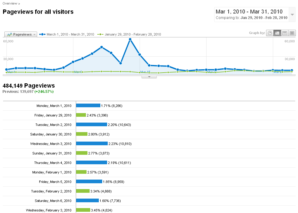 |
| Click the image for a screenshot of the Pageviews Google Analytics report. |
Outside of the United States, dates are usually written in the reverse order (March 14 is 14/03), so that date oughtn't have any special significance to international Pi lovers. Or does it?
The Question: Is Pi Day merely a United States phenomenon, or is March 14 a day close to the hearts of Pi lovers worldwide?
To see this, I looked at pageviews outside of the United States for Pi-related pages. See the sidebar for more information on how to do this in Google Analytics. The graph below shows that Pi-related pageviews indeed increased significantly around Pi Day outside the US (a 226% increase).
| March vs. February Pi Pageviews – Non-US Visitors Only |
|---|
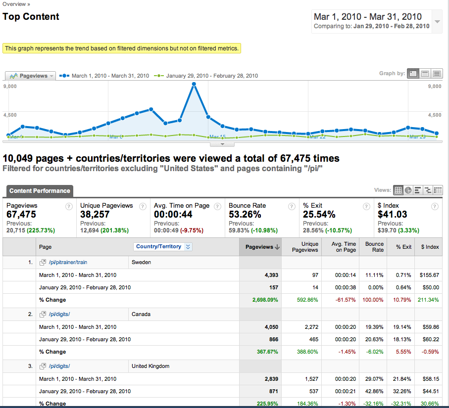 |
| Click the image for a screenshot of the Top Content Google Analytics report, filtered to include only Pi-related pages visited from outside the United States. |
Furthermore, drilling down into the Google Analytics reports, I can see that, in Sweden, Pi Trainer usage increased by a whopping 2698%. Canadians viewed the Pi Digits page 368% more times than they did the preceding month. Even in Belgium, Pi Trainer usage was up 140%.
The Answer: Pi Day is a global phenomenon. Yay!
At the top right corner of my home page is a photo selected randomly from the over 700 (at the time of this writing) photos that I've deemed "worthy" of the Random Photo spot. These photos can be clicked on to view a larger version, caption, etc. Interestingly, different photos have vastly different clickthrough rates, with a high of about 65% and a low of about 2%. (Clickthrough rate is the percentage of times a photo shown is clicked on. For example, if the clickthrough rate is 20%, that means that a user clicked on the photo 20 out of every 100 times the photo was shown.)
Below is a chart that shows the distribution of Random Photo clickthrough rates. A few photos have unusually high clickthrough rates; the rest show a smoother distribution of clickthrough rates that trails off gradually.
| Random Photo Clickthrough Rate Distribution |
|---|
| Click the image for a dynamic graph with Random Photo statistics. |
|
How To How do you calculate clickthrough rates of page elements (such as Random Photos)?
|
The median clickthrough rate for my Random Photos is about 17%. However, I have three "superstar" photos with clickthrough rates over 60%. They appear below:

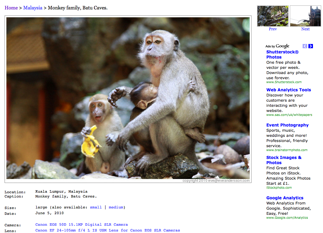
Location: Kruger, South Africa Views: 1466 Clicks: 954 Clickthrough Rate: 65.08% |
Location: Tikal, Guatemala Views: 2017 Clicks: 1275 Clickthrough Rate: 63.21% |

Location: Chichicastenango, Guatemala Views: 1988 Clicks: 1213 Clickthrough Rate: 61.02% |
If I were to pick the three most click-worthy photos, I would never have correctly chosen the winners. No, my choices have much, much worse clickthrough rates:

Location: Timbavati, South Africa Views: 1444 Clicks: 442 Clickthrough Rate: 30.61% |

Location: Kruger, South Africa Views: 1552 Clicks: 798 Clickthrough Rate: 51.42% |
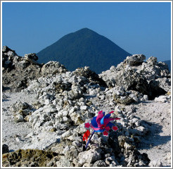
Location: Mt. Osorezan, Japan Views: 1836 Clicks: 448 Clickthrough Rate: 24.40% |
While my three photos have better-than-average performance, they still perform much worse than the actual high performers. If I want to optimize clickthrough rates, I should to use Web Analytics, not intuition.
What can we learn from my photos' clickthrough rates, if anything, about why people click on the photos they do? While it would be fun to do a statistical analysis of this – categorizing photos based on subject matter, location, recency, color palette, expert's rating of quality of composition, etc. – I quickly run into sparseness issues with my limited data set. So, I'll have to resign myself to putting forth a hypothesis and a few small shreds of evidence.
The three main reasons (either conscious or subconscious) I can think of that someone would click on a photo are:
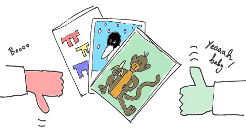
Here are two photos with basically identical properties (subject matter, recency, level of detail, etc.) except for one: the one on the left is more attractive than the one on the right:

Location: Kruger, South Africa Views: 1484 Clicks: 401 Clickthrough Rate: 27.02% |

Location: Kruger, South Africa Views: 1524 Clicks: 226 Clickthrough Rate: 14.83% |
The clickthrough rate of the attractive photo is nearly twice that of the "plain" photo, lending support to Reason #1 – that beauty is an important factor. (Other similar examples appear in the data set; see the Random Photo Clickthrough Rate Distribution for all the photo statistics.)
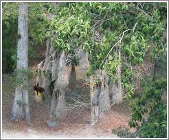
How about Reason #2 – that there is detail that must be enlarged in order to properly see it? This doesn't appear to be the case. My evidence isn't strong; I don't have two photos that are identical in every way except level of detail, nor do I have enough high-detail photos to conduct a statistical analysis with any level of certainty. However, if you look at the 3rd most popular photo (brooms), there is very little detail but a high clickthrough rate, so detail doesn't seem to be a factor at play, at least for this photo. In fact, at the time of this writing, the very worst performing photo (of an intricate ceiling by Antoni Gaudi) has much detail but a paltry clickthrough rate of 2.4%.
And Reason #3 – that the photo location is interesting? I would love to do a country-by-country analysis, but due to data sparsity, I will limit it to two groups: Exotic and Non-Exotic. The majority of my visitors are from the United States (55%), so I'll classify US photos as Non-Exotic and the rest as Exotic.
The following shows clickthrough stats for photos with Exotic vs. Non-Exotic locations. (Only photos that have appeared as Random Photos at least 100 times are included in the samples.)
| Location | Number of Random Photos | Median Clickthrough Rate | Mean Clickthrough Rate | Pooled Number of Views | Pooled Number of Clicks | Pooled Clickthrough Rate |
|---|---|---|---|---|---|---|
| Exotic | 403 | 18.12% | 19.10% | 529535 | 106978 | 20.2023% |
| Non-Exotic | 76 | 18.06% | 19.24% | 125143 | 25290 | 20.2089% |
There is no statistical difference in clickthrough rate (at a 95% confidence level) between the two sets of photos, thus discrediting Reason #3.
Summary: Beauty appears to be an important influencer of photo clickthrough rates. Level of detail and location (where the photo was taken) appear to be unimportant. A statistical study on a larger sample size would be needed to put these hypotheses to the test.
Open question: Why do people click on the second most popular photo? It's not a great photo, in my opinion.

|
How To How can you use a conversion funnel in Google Analytics to determine whether people are completing the actions you want them to on your site – and where they drop out along the way?
|
Online retailers can expect conversion rates of around 3%. By this, I mean about 3% of visits to their site result in an online purchase. Even if a visitor adds an item to their shopping cart, there's still the problem of cart abandonment; only about a 50% will actually go through with the purchase. Because of these low conversion rates, retailers are missing out on a lot of potential revenue and thus they are – or should be – focused on conversion optimization, i.e., examining the pages that visitors visit and seeing where they drop out. This set of pages leading to the end goal is known as the "conversion funnel".
These analysis techniques aren't limited to commerce, of course. Conversion funnels can be used when measuring the effectiveness of any online flow that you care about. Here's one I care about:
The Question: Are visitors to Pi Land more or less likely to "convert" than the average commerce visitor? More specifically, of those who visit Pi Land, how many use the Pi Trainer? Of those who start the Pi Trainer, how many go through an entire training session?
To examine this, I created a conversion funnel containing the following pages:
/pi/), the starting point.
/pi/pitrainer/), where the visitor specifies how many digits of pi they want to practice (and other options). If a visitor reaches this page, they've officially "started" the Pi Trainer.
/pi/pitrainer/train/), where the visitor types in digits. The visitor might go through this page many times, depending onhow many digits they're entering. Conversion tracking in Google Analytics tracks only one visit to this page per session, which is fine.
/pi/pitrainer/train?done=t), which shows the visitor their score. This is the end of the funnel; i.e., when a visitor reaches this page, a "conversion" has occurred.
| The Pi Trainer Conversion Funnel |
|---|
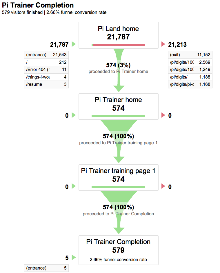 |
| Click the image for a larger screenshot of the Pi Trainer conversion funnel report. |
The Answer: By looking at the funnel report (screenshot above), I see that merely 2.7% of Pi Land visitors last month chose to use Pi Trainer (instead, the most popular pages are Pi digit-related). If I wanted to drive more traffic to Pi Trainer, I should make the Pi Trainer link more prominent than the Digits link. The good news is that, remarkably, every single visitor who started the Pi Trainer finished it. (The report shows a handful of people who went to the last page without visiting the previous ones. These must be people who bookmarked the page to revisit their scores; the evidence is that these are all marked as site "entrances".)
In short, people who use the Pi Trainer are dedicated memorizers of Pi (and my user interface wasn't bad enough to drive them away).
Except for my annual high-traffic month of March (due to Pi Day, as discussed previously), my site traffic follows a generally consistent pattern, with roughly 2000 visits per day on weekdays and 1500 on weekends. When there's a traffic spike, I question its cause.
Web sites typically experience traffic jumps for a few reasons:
Reason #1 doesn't apply to my site, since I do very little online marketing. (I do a little bit for fun in order to play with the data, but 98% of my site traffic is organic.) Let's look at two examples that demonstrate Reasons #2 and #3:
Example 1: A spike caused by news event.
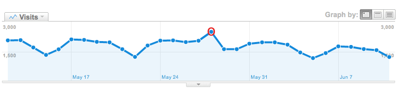
A mini-spike in traffic occurred on May 28, as shown below:
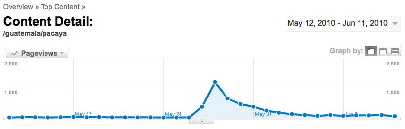
Visits May 12 - June 11, 2010 Click the image for a larger version of the Google Analytics Visits graph. Looking at the Top Content report, I see that my Volcan Pacaya page is ranked much higher than it usually is. Indeed, when I drill down into page-level statistics for just that page, it becomes clear that visits to this page have suddenly jumped:
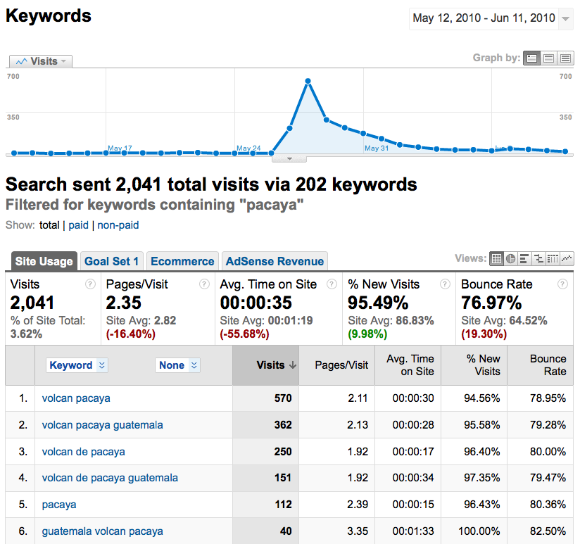
Volcan Pacaya Pageviews May 12 - June 11, 2010 Click the image for a larger version of the Google Analytics Pageviews graph. This increase in pageviews was driven by search engine traffic. Using the Keywords report, I can see the spike in search keywords containing "pacaya":
Search keywords containing "pacaya" May 12 - June 11, 2010 Click the image for a screenshot of the Google Analytics Keywords report, filtered to show only keywords containing "pacaya". A web search reveals that Volcan Pacaya in Guatemala erupted on May 27, thus explaining the increase in related pageviews.
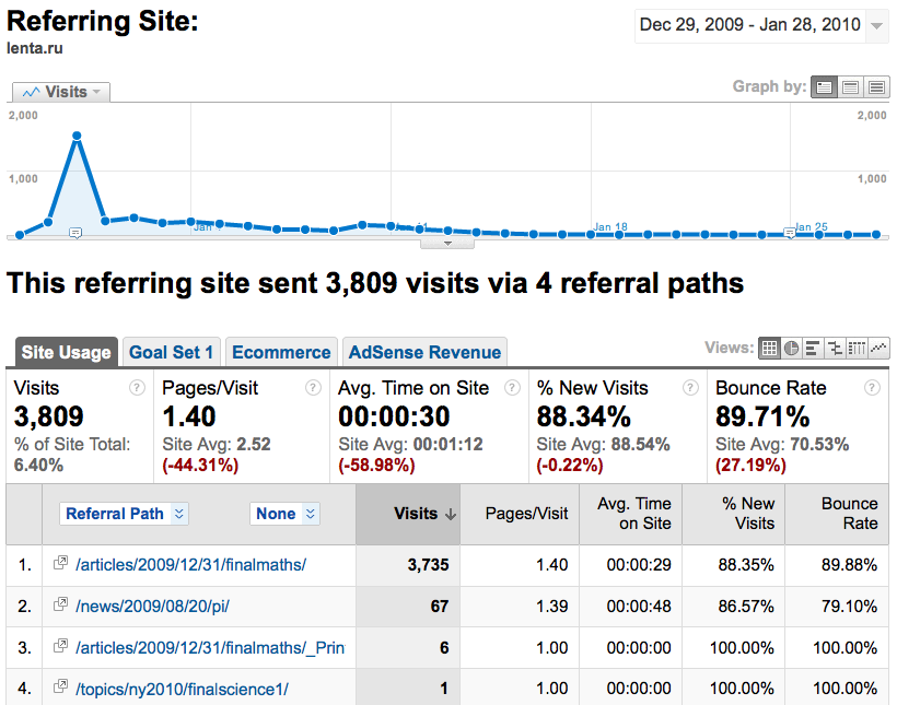
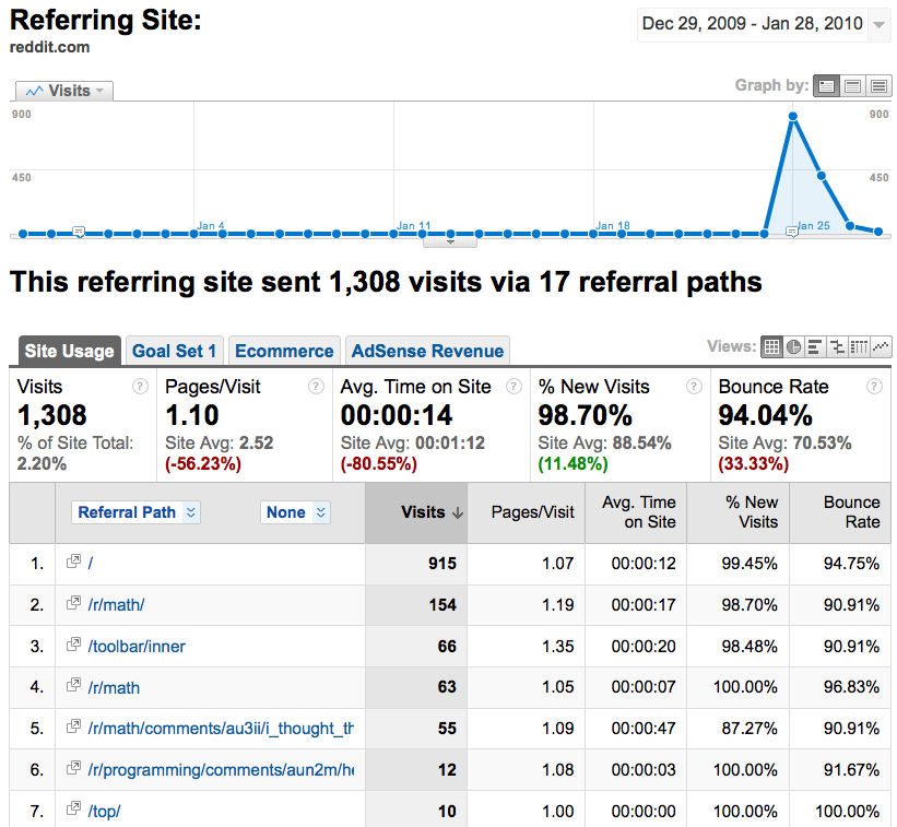
Example 2: A spike caused by a link from a popular site.
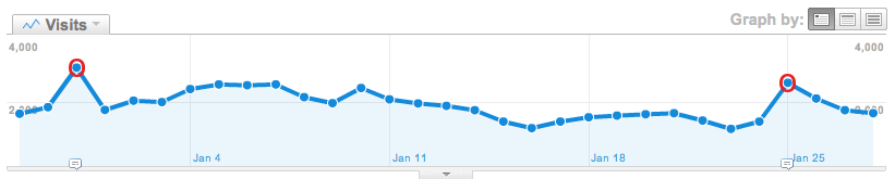
Two spikes occurred in the one month period from December 29 to January 28:
Visits December 29, 2009 - January 28, 2010 Click the image for a larger version of the Google Analytics Visits graph. Looking at the Referring Sites report, I see that Lenta.ru, a Russian newspaper, and reddit, a social news site, are both higher in the referrals rankings than usual. Drilling down into reports for just those two referring sites, I see the following visit graphs, corresponding precisely to the two spikes previously observed:
Lenta.ru and reddit Referrals December 29, 2009 - January 28, 2010 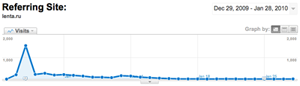
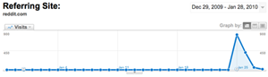
Click the images for a larger versions of the Google Analytics Referring Site reports. I can learn what pages on my site these two referring sites link to either by visiting those sites (specifically visiting the pages listed in the Referring Site report) or by adding the Landing Page dimension to the Referring Site report. Both sites happened to run Pi stories linking to Pi Land during this period.
|
How To How do you do custom visitor segmentation in Google Analytics?
|
Marketers and business owners can gain a much deeper understanding of their visitors and site usage by performing visitor segmentation. For example, do First-time Visitors view different content than do Return Visitors? Do users who have registered an account on the site have higher average order values than others? Are visitors to the Help Center more likely to make a purchase than those who never visit that section?
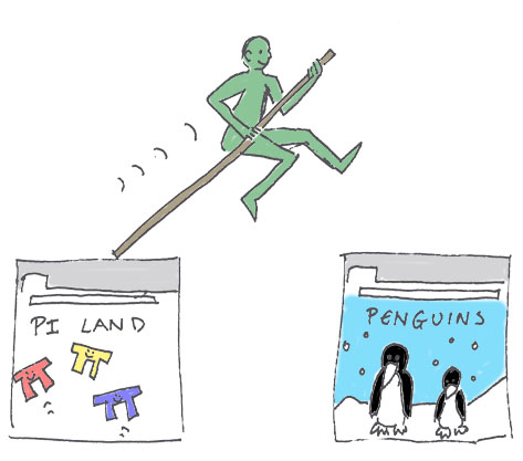
In the same vein, I can segment my visitors as Pi Geeks versus "regular" people. (Of course, I use the term "Pi Geek" affectionately, being one myself.) I define the Pi Geek segment as anyone who arrived at my site through Pi Land.*
*Technicality: Landing Page is a session-level attribute, not a visitor-level attribute. This means that if someone landed on Pi Land yesterday (and then went away), and then landed on my Antarctica page today, they wouldn't be counted as a Pi Geek today. Thus Pi Geeks are theoretically undercounted. However, in reality I don't expect this to have a large impact on metrics. This limitation can be worked around using Custom Variables.
The Question: Does cross-pollination occur; i.e., do Pi Geeks also visit other parts of my site?
To answer this, I create a custom Pi Geeks visitor segment (see sidebar for instructions). Once I've done that, I can view Google Analytics reports for just that visitor segment and see whether they look at non-Pi pages.
The following report shows that Pi Geeks visited non-Pi pages on my site only 1308 times last month, which is very small compared to the 75,244 Pi-related pageviews. So, most stick to Pi Land. Of those who venture out of Pi Land, most visit my home page (which makes sense; that's the only page linked to from Pi Land). Those who view actual content on my site want to know How I would spend my time if I didn't have a day job.
| Top Non-Pi Content Visited by Pi Geeks |
|---|
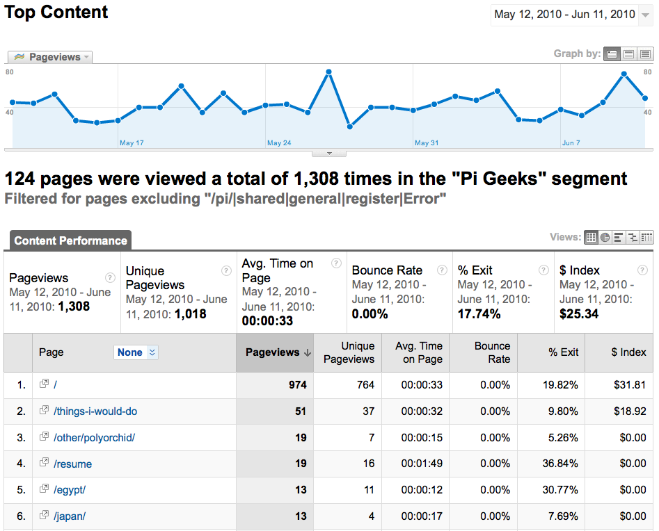 |
| Click the image for a screenshot of the Top Content report. |
Where do Pi Geeks go after they view my home page? The Navigation Summary report shows that most go right back to Pi Land:
| Navigation Summary for Pi Geeks Entering and Leaving the Home Page |
|---|
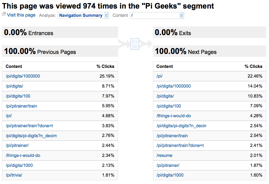 |
| Click the image for a screenshot of the Google Analytics Navigation Summary report. |
The Answer: Pi Geeks are happiest in Pi Land. The rest of my site is of little interest to them.

|
How To How do you conduct an A/B test? The basic premise of an A/B test is that you randomly direct traffic to two or more alternative pages to determine which page has the best performance. It's up to you to decide what "best performance" means for your site (e.g., high order completion rate or low bounce rate). A simple way to run an A/B test is to use a tool such as Website Optimizer. This does all the hard work for you such as directing visitors to a random page variation and calculating statistical significance of the results. If you need more flexibility, you can set up A/B tests yourself by writing a little bit of code. Your code will need to:
|
Bounce rate is an important measure of visitor engagement with your site. A "bounce" is defined as a one-page site visit (e.g., if a visitor arrives at your site through a search engine, glances at the landing page, and then clicks the Back button). A bounce is like a blind date showing up at your doorstep, taking one look at you, and running away. So, obviously, a high bounce rate is an undesirable thing (except on sites such as blogs where you expect the visitor to just read today's update and then leave).
A large percentage of pageviews on my site are photo pages. People arrive through search engines, view one photo, then promptly leave. I don't like this; I want them to stay.
The Question: What bounce rate can I achieve by modifying my photo page UI? I'll never get it down to zero because of the nature of users conducting photo searches (they're looking for something specific; they're not here to browse), but I ought to be able to entice a few to stay.
I decided to run an A/B test (or, more accurately, an A/B/C test) to measure the effect of three page layouts on bounce rate. Layout A is the control, with the same layout that was present before the start of the test. Layout B adds small Previous/Next thumbnail images after the caption. Layout C has larger Previous/Next thumbnails but they have been moved further to the right on the page. Each visitor is given an equal chance of being assigned to test group A, B or C (once assigned, they remain in that group; otherwise, the changing layout would cause confusion).
Here are the three layouts:
Layout A: Control
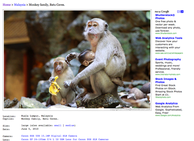
Layout B: Small Navigation Images
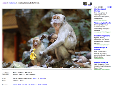
Layout C: Large Navigation Images

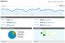
I ran an A/B test for three weeks using the second method described in the sidebar. The graph below displays bounce rates for all three test groups (as well as for the site as a whole).
| Bounce Rate for All Visitors, and for Visitors Given Layout A, Layout B, and Layout C |
|---|
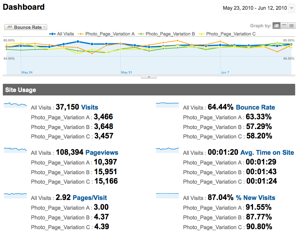 |
| Click the image for a screenshot of the Google Analytics dashboard. |
The graph shows a lot of day-to-day variability in bounce rate for the three test cases. The results may be clearer if we look at some summary statistics:
| Test Case | Bounce Rate | Number of Visits | Number of Bounces |
|---|---|---|---|
| A | 63.33% | 3466 | 2195 |
| B | 57.29% | 3648 | 2090 |
| C | 58.20% | 3457 | 2012 |
Over the test period, B appears to have the lowest bounce rate, followed closely by C. The control, A, appears to be the worst. Tests of statistical significance show that B and C are indeed better than A (at a 95% confidence level), but B and C have no statistical difference in bounce rate from each other. If I want to definitively determine which variation is superior, I will have to run the test for a longer time period. Idea for a future test: put a search box on the photo page.
The Answer: With a simple UI change, bounce rates improve by about 5%.
Using some fairly straightforward Web Analytics techniques, I've learned that Pi Day is a global phenomenon; that some photos on my site generate much more interest than others; that Pi Trainers are dedicated people who do not abandon their training sessions; that certain news events and links from other sites cause spikes in my site traffic; and that Pi Geeks are happiest in Pi Land (and uninterested in the rest of my site).
I was also able to make and test user interface improvements to my site in order to better retain visitors.
For me, this was a valuable use of a few hours. For online businesses, similar analysis techniques (applied to less whimsical questions, of course) can yield significant revenue improvements. I hope through my "fun" site analysis I've helped show how powerful – and not too difficult – these analysis tools and techniques can be.
Great article!
Very well written. Detailed, interesting and useful.
-- Amit Agarwal
Shift to big data begins with small data tools like Google Analytics
This are amazing experiments. The tech world is going crazy about the big data, but in my view, starting small with Analytics can help a lot to businesses in understanding consumer behaviour
-- Moin Shaikh